Arquitos


Client
Arquitos
Project
Branding

Year
27/03/2025
Link
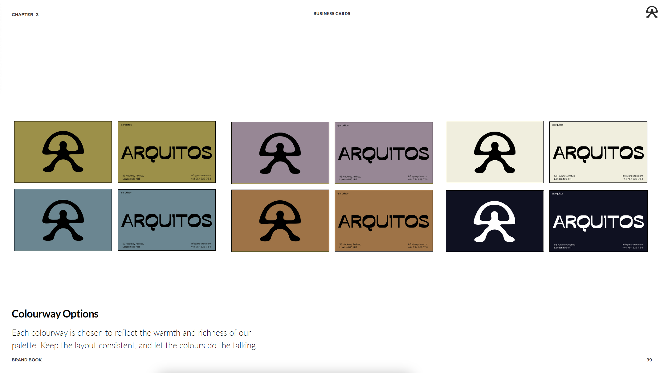
As the branding designer for Arquitos, I led the strategic and creative development of a distinctive visual identity that authentically reflects the brand’s core values: flavour, authenticity, modernity, and sustainability. Drawing inspiration from the brand’s unique location beneath the train arches, I developed a design system centred on the concept of the arch—used as both a structural and symbolic motif to convey stability, warmth, and connection. Also, drawing from the Índalo symbol—a figure with arms raised traditionally associated with protection and harmony—I reimagined it through negative space to depict a person holding up an empanada, celebrating both nourishment and cultural roots. This form is framed within an arch, inspired by the train arches where the brand is based, symbolising support, openness, and the grounded nature of the business.
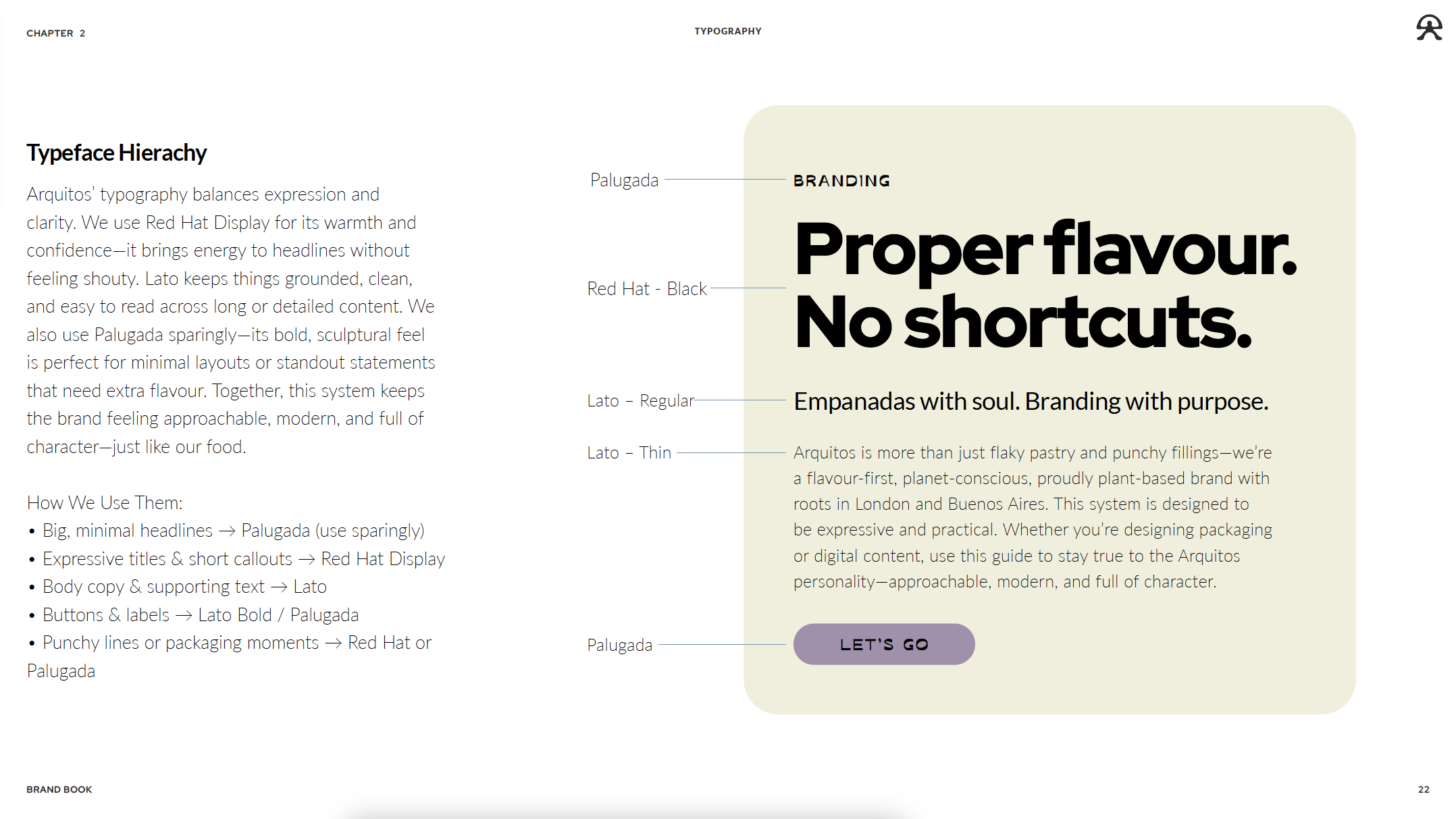
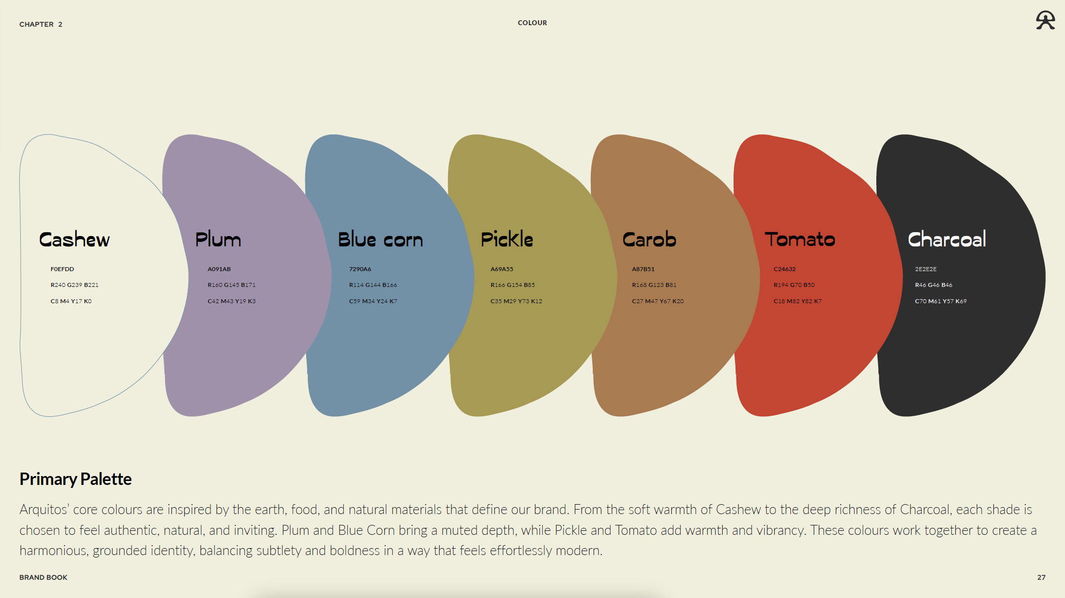
The visual language I crafted is built around a harmonious balance between artisanal charm and contemporary edge. A carefully curated colour palette inspired by natural ingredients and a vibrant rainbow spectrum speaks to diversity and inclusivity, while clean typography and minimal layouts ensure clarity and sophistication. The tone of voice guidelines were developed to position Arquitos as confident yet warm, with messaging that celebrates plant-based living without preaching. From packaging design to digital presence, every touchpoint was designed to ensure consistency, recognisability, and emotional resonance. This holistic approach not only honours the brand’s mission but also sets a strong foundation for long-term growth and customer loyalty.
Branding Designer